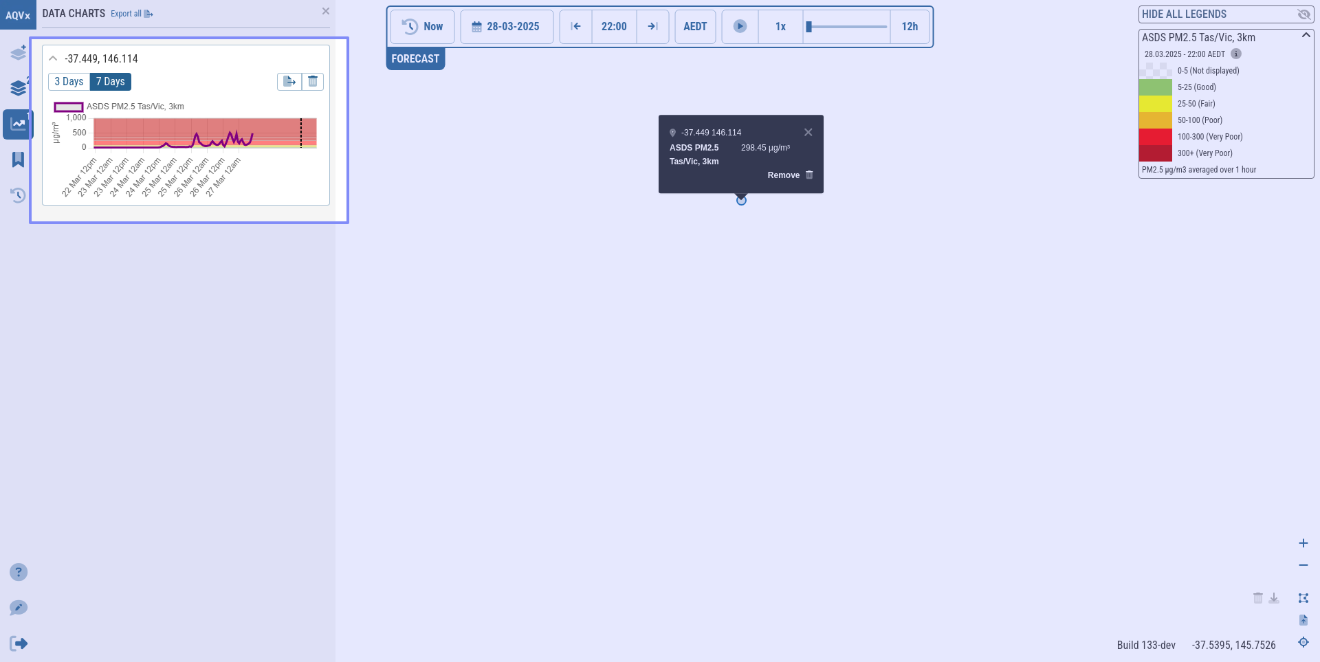
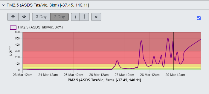
the graphs on loading are useful in the legacy version as they are clear and can be read, whereas in the new version they are not clear and you can’t see anything much. Can the graphs be made to match the appearacy of the legacy on opening? In particular the labeling of the axis, zooming into the maximum value of PM2.5 of the axis. In the legacy you can see all the categories a dn read the dates clearly.