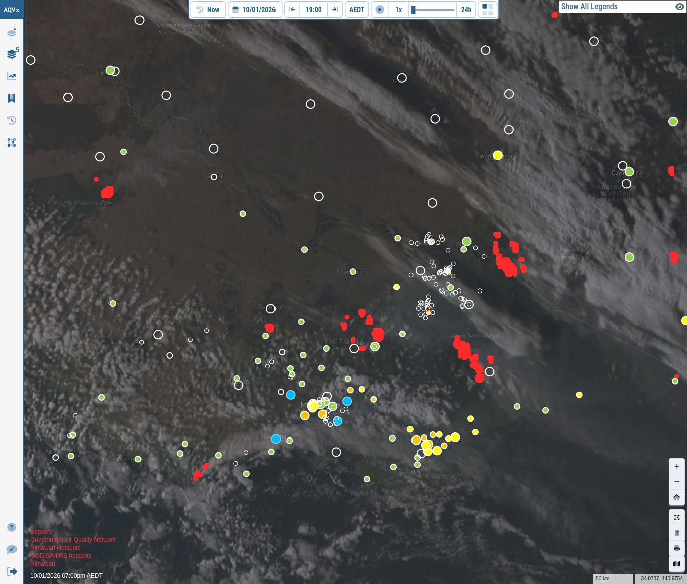
Hi All- I’d liike to see colour scale maintained on selected AQ monitoring stations. In the application shown (Sat 10th- smoke impacts on Melb/LV)- it is good to step through the hours and visualise the smoke movement, including when it impacts the monitoring stations. How about having just a blue outline while maintaining the concentration colour fill?