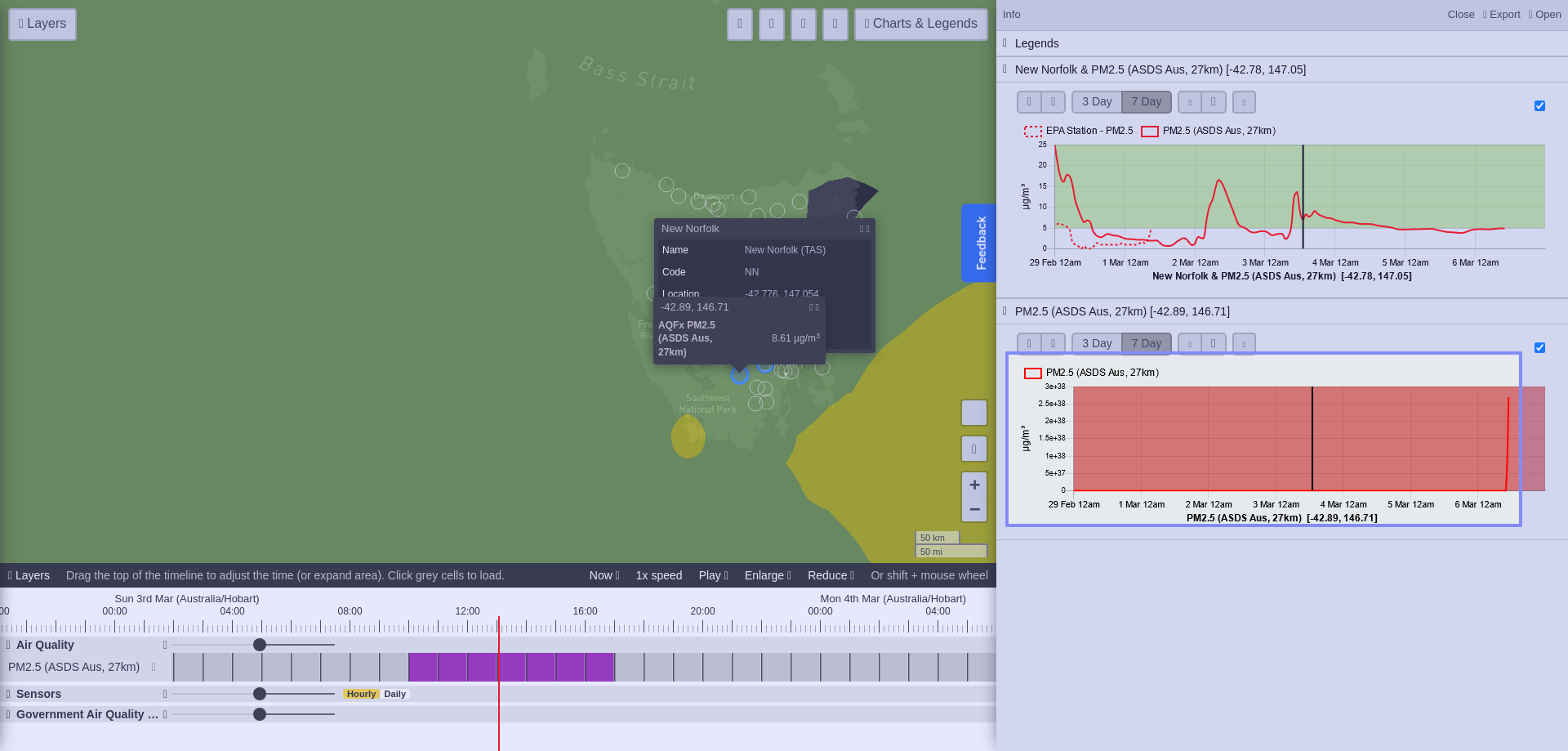
When you first click on an area on the map and bring up the time series plots, the graph often looks like this. You have to play around with the arrows to get the chart to the correct scale.
t
When you first click on an area on the map and bring up the time series plots, the graph often looks like this. You have to play around with the arrows to get the chart to the correct scale.
t
Please authenticate to join the conversation.
Planned
🐛 Bug Report
Over 2 years ago
Get notified by email when there are changes.
Planned
🐛 Bug Report
Over 2 years ago
Get notified by email when there are changes.