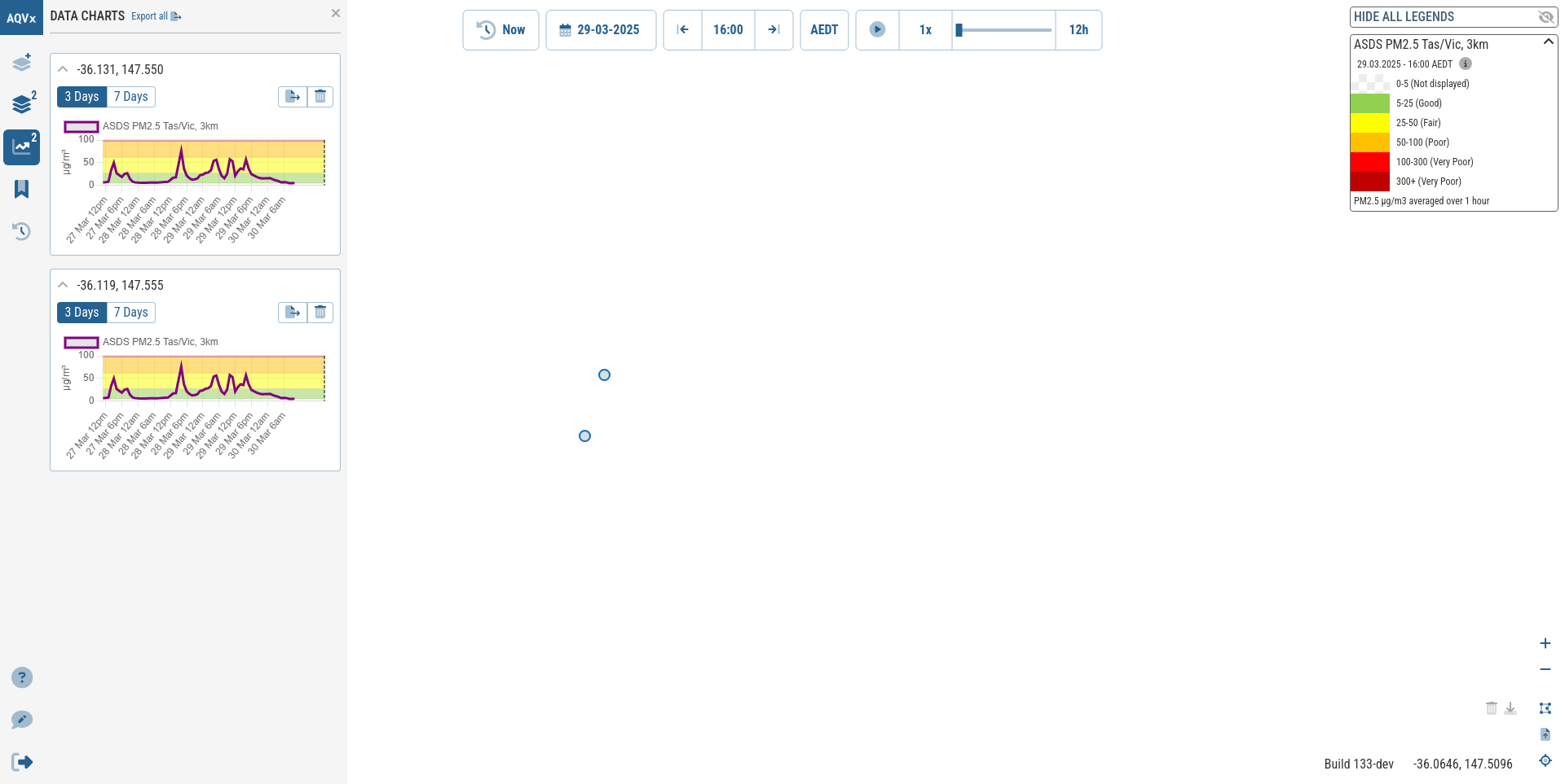
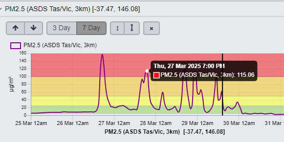
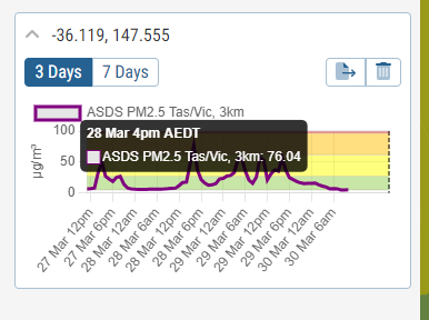
It is difficult to see where you are selecting on the graph when you get the popup with the contrentration. This works very clearly in the legacy version. I have included a screen shot of both to compare. Also there is no colour shown for the category as there is in the legacy version.